Interaction & Motion Design
✻
Interaction & Motion Design ✻
What’s the difference between UX & Interaction Design (Ixd)?
“UX, User Experience, is holistic, focusing on users' overall satisfaction and interaction with the company and its products, as explained by Don Norman, the inventor of the term "user experience." More recently, UX has come to refer specifically to the user experience with a solution and customer experience (CX) to the whole relationship with the company.
UID, User Interface Design, deals with the visual components users interact with, such as buttons, icons, and layouts, aiming for aesthetic and functional harmony. Interaction Design orchestrates the user's engagement with these components, ensuring effective, enjoyable interactions.”
— Interaction Design Foundation
IxD design is important to be thinking about throughout the entire user experience journey. It addresses important opportunities to reduce cognitive load, add delight or a feeling the brand wants to embody (such as professional, witty, fun, etc.), and contribute to the overall feeling of “polish” which increases users’ trust in the brand and its products. I primarily use Adobe After Effects and Rive.
Design System Management (DSM) — Motion Standards
Motion Tokens & Components
As part of a design system, motion is key to consider. Motion tokens ease hand-off and eliminates guesswork for the development team. Building components with motion in mind creates a consistent look and feel across a product or organization as a whole.
Motion standards documentation (was still under construction in 2024)
Components
Coach mark component transitions
Touch interaction for a tabbed carousel component (tablet view)
PMI Infinity
AI Response Enhancement
PMI Infinity (light theme UI) is based off ChatGPT (dark theme UI) where the responses load in a disruptive way. Auto-scrolling makes it difficult for the user to read content while the response continues to load. The enhancement removed auto-scroll and increased the amount of text loaded at one time, making it far less disruptive, putting control back into the users' hands.
Volunteer Hub IxD
Volunteer Opportunities
Favorite an opportunity (design was not final)
Volunteer Chapter Recruiters
Volunteer chapter recruiter reviewing an applicant and internally/privately leaving a comment to discuss with other recruiters
Volunteer chapter recruiter assigning a new role
Career Navigator
Onboarding Animations
Destination Feature
Mobile-specific interactive scrub to ease comparing options
Other UI Animations:
KORBYT
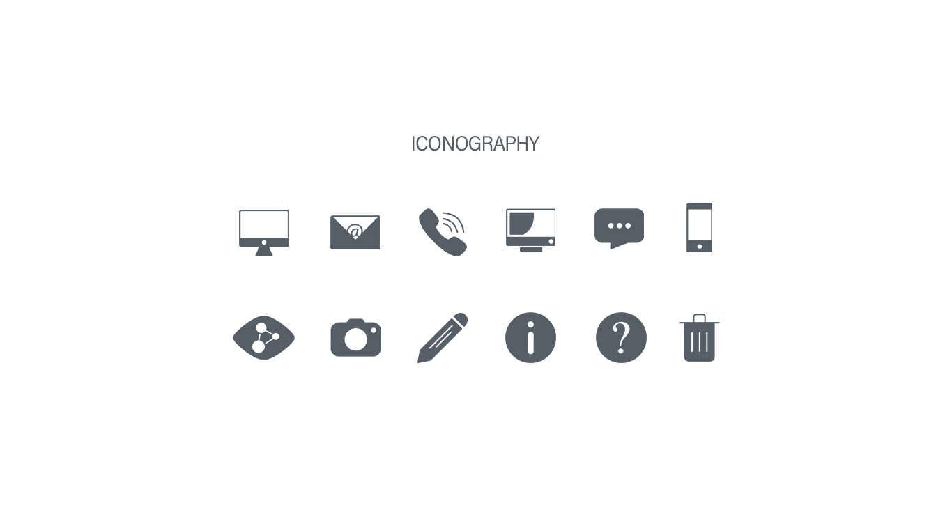
Iconography
I designed the Korbyt software icons to have their own look and feel—friendly and approachable. To achieve this feel, most edges of the icons are rounded and soft, and the outlined look is predominantly used, which makes them feel light and airy. I also created multiple versions of each icon—solid, outline, solid circle, outline circle and solid color in order to have the appropriate visibility and user experience as it related to hovering buttons, applying certain settings and also disabled buttons. Final format is svg.
Like Button
The "like" button I designed to be used in the KorbytGO application after a user likes a post in the news feed. Fun and flair was the goal!